Figma, StoryBook, MIRO, JIRA, Paper & Pencil
Title Insurance is a national provider of title and settlement services to the real estate industry in the United States. With a wide operational footprint and increasing digital demands, the company needed to modernize its user experience and unify its fragmented design efforts across teams, tools, and platforms
To build a scalable, responsive, and modular design system that could:
Title Insurance’s existing digital products lacked a centralized design system, resulting in inconsistent interfaces, redundant developer work, no unified component library, siloed teams, an unstructured design-to-development workflow, and outdated designs misaligned with user expectations.
Scalability: Existing designs were built ad-hoc, failing to scale with evolving user needs and growing complexity.
Efficiency: Teams spent extra time recreating components and revalidating UI patterns for every feature.
Consistency: Lack of shared guidelines led to visual and functional inconsistencies across products.
Speed: Design handoff to developers was slow and unclear, delaying releases.
As a crucial first step in the design process, I conducted in-depth research to understand Title insurance’s specific needs. I analyzed similar platforms, examining content structures, visual styles, and interaction patterns. By gathering insights from different insurance portals, and industry-related systems, I identified key trends and best practices to inform the wireframing stage.
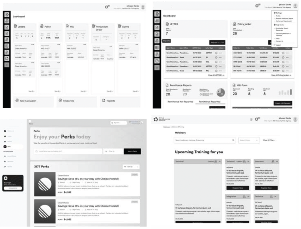
After completing my research, I had a clear vision of the content structure for each site and how it could be presented. While designing wireframes, I identified common UI elements for potential inclusion in the design system.
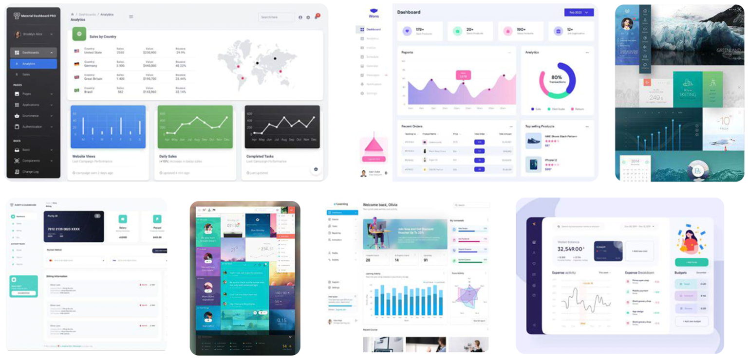
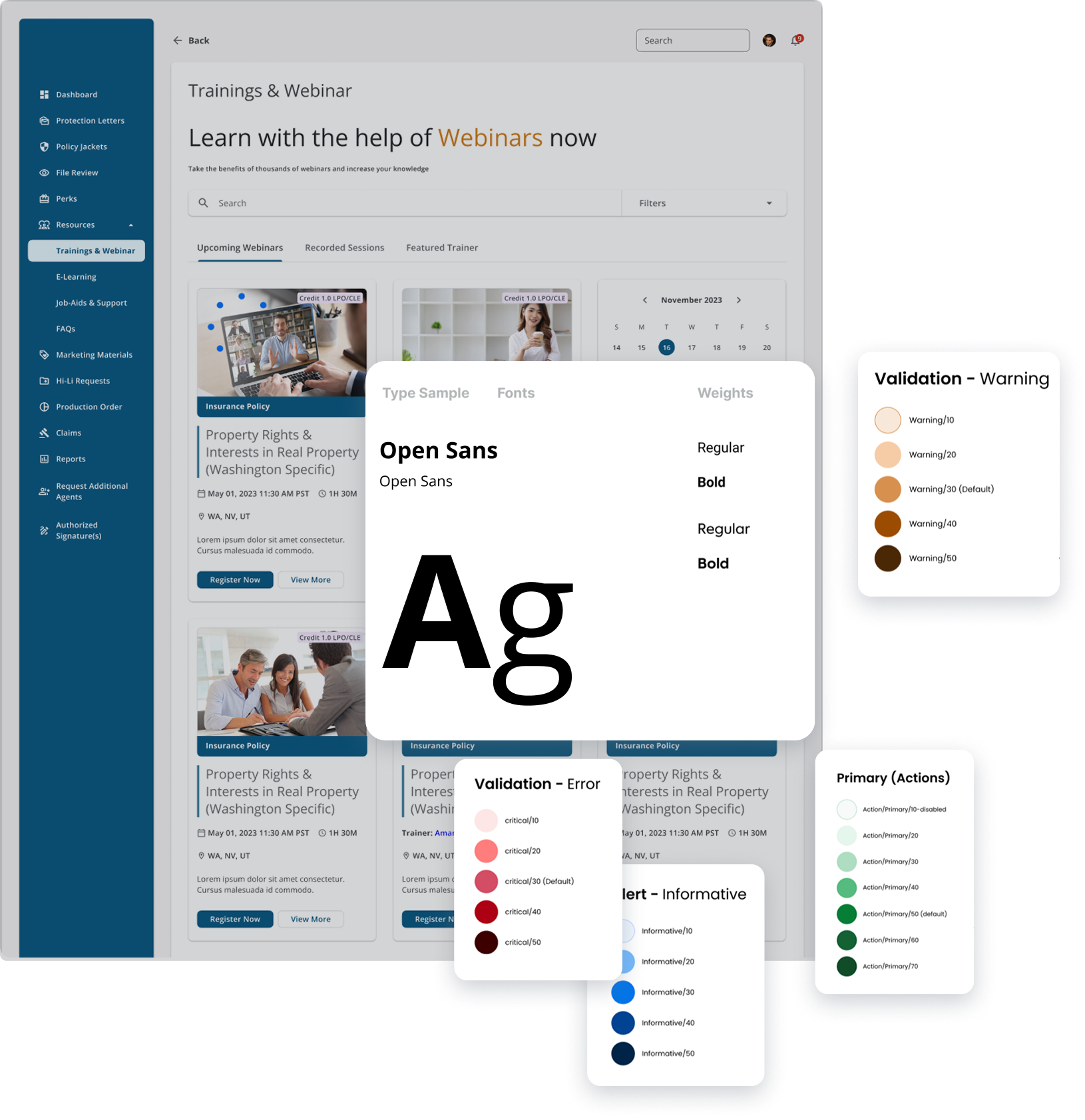
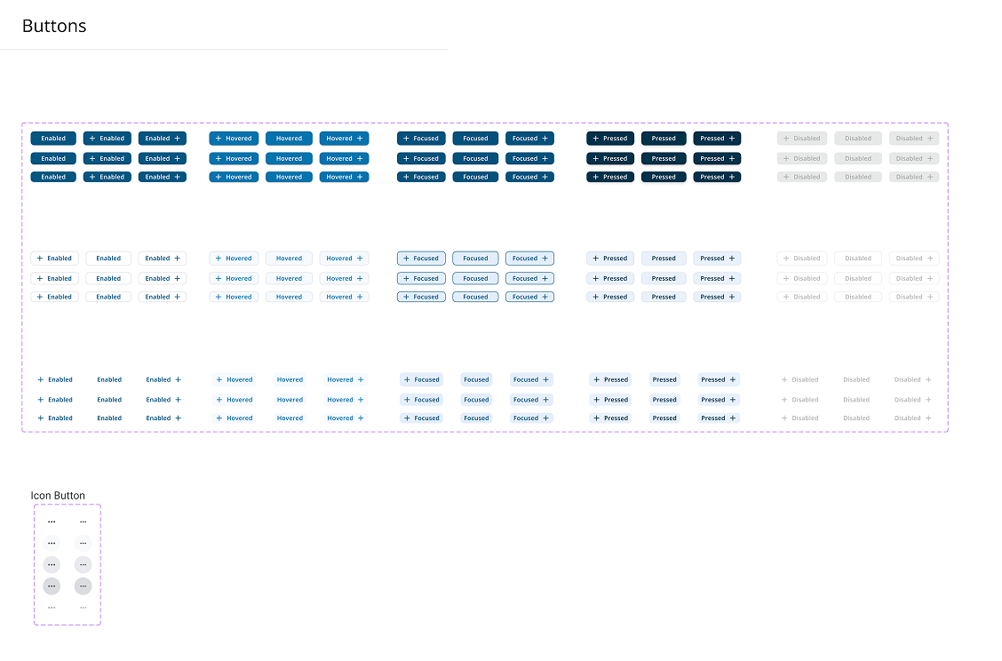
Before moving into the design phase, I first defined key visual styles, including color, typography, interactive elements, and imagery. After exploring various combinations, I established a cohesive design language aligned with Title Insurance’s brand, using typography that reflects its identity and a color palette that enhances clarity and trust in the title insurance process

Moodboards enhance collaborative design thinking by aligning teams and stakeholders, fostering iterative feedback loops, and refining the visual language early in the process. They support consistency, brand alignment, and cognitive affordance, helping designers communicate concepts effectively while ensuring a user-centered and scalable design direction.
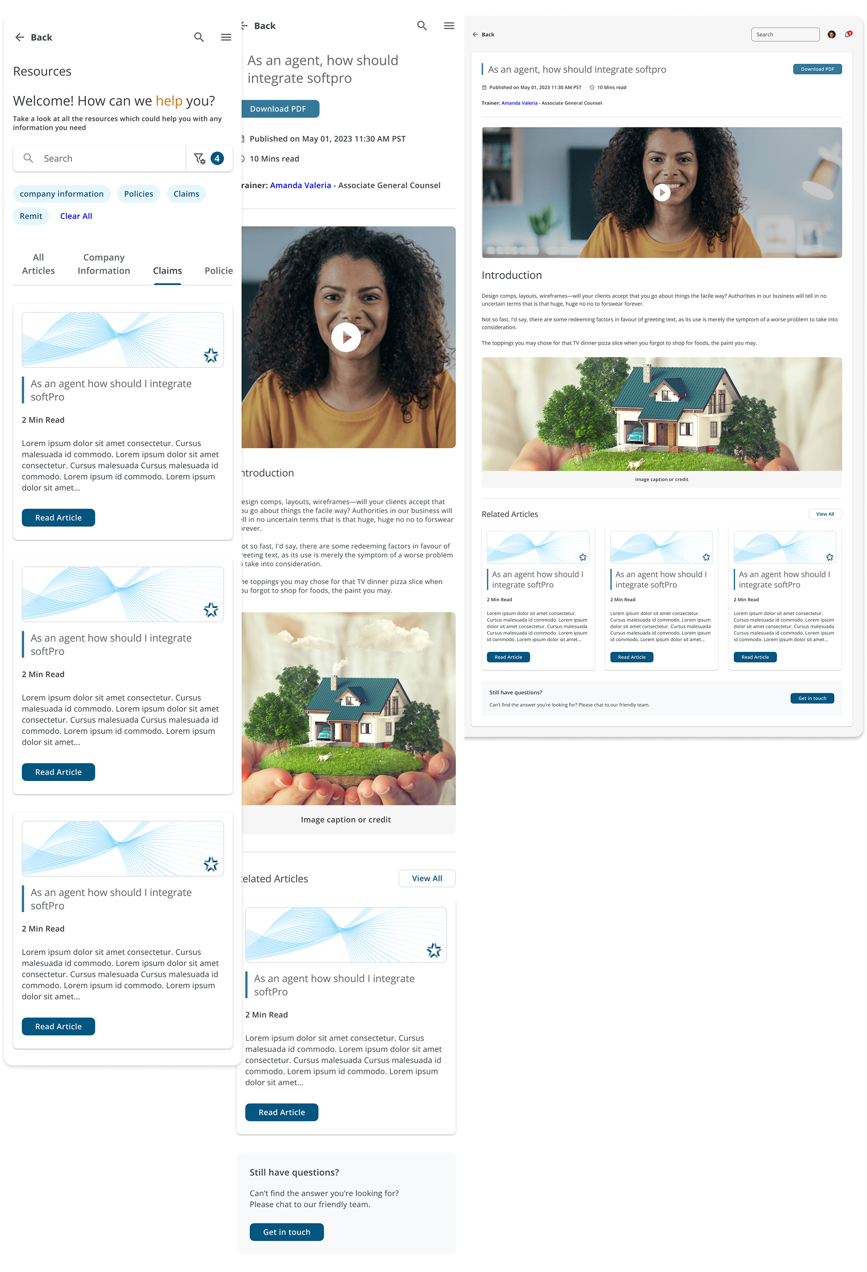
The final designs seamlessly adapt across desktop, mobile, and tablet, ensuring consistency, accessibility, and scalability. Every component is optimized for responsiveness, enhancing usability, performance, and a unified brand experience across all devices.

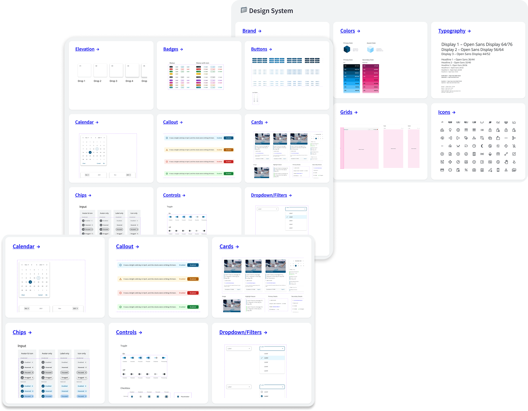
Atomic Design (AD) is a methodology that structures design by breaking it down into its smallest building blocks – Atoms. These Atoms combine to form Molecules, Organisms, Templates, and Pages, creating a systematic, scalable, and reusable approach to UI design. By starting at the foundational level, AD ensures consistency, flexibility, and efficiency across products.
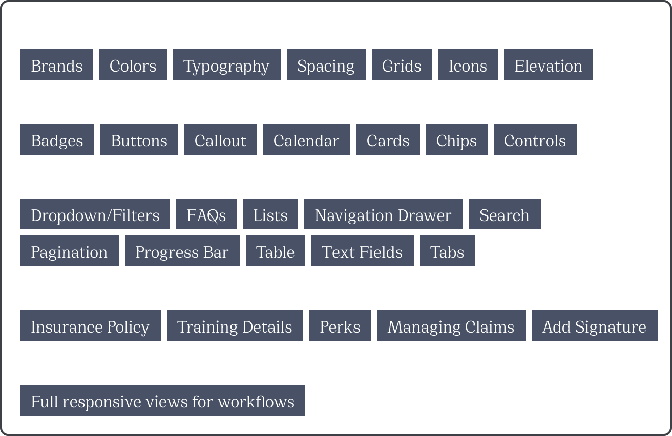
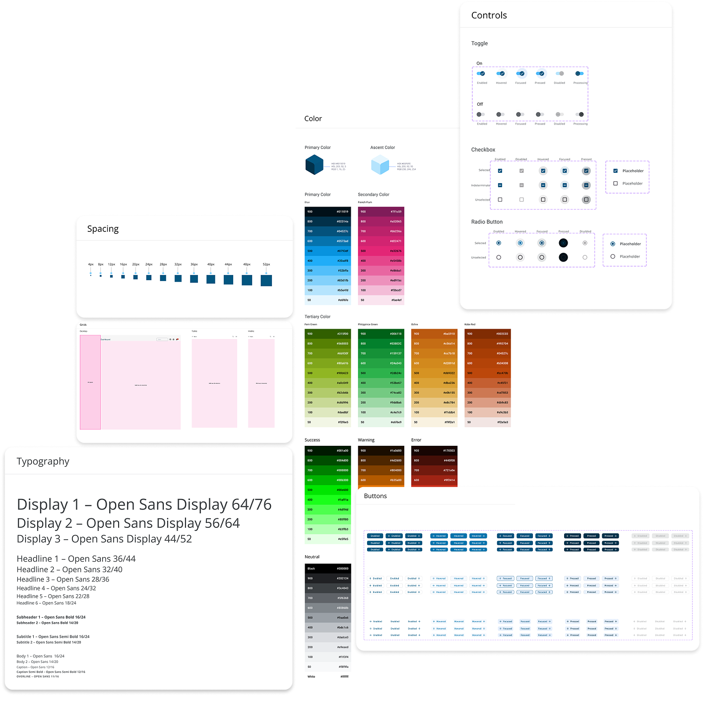
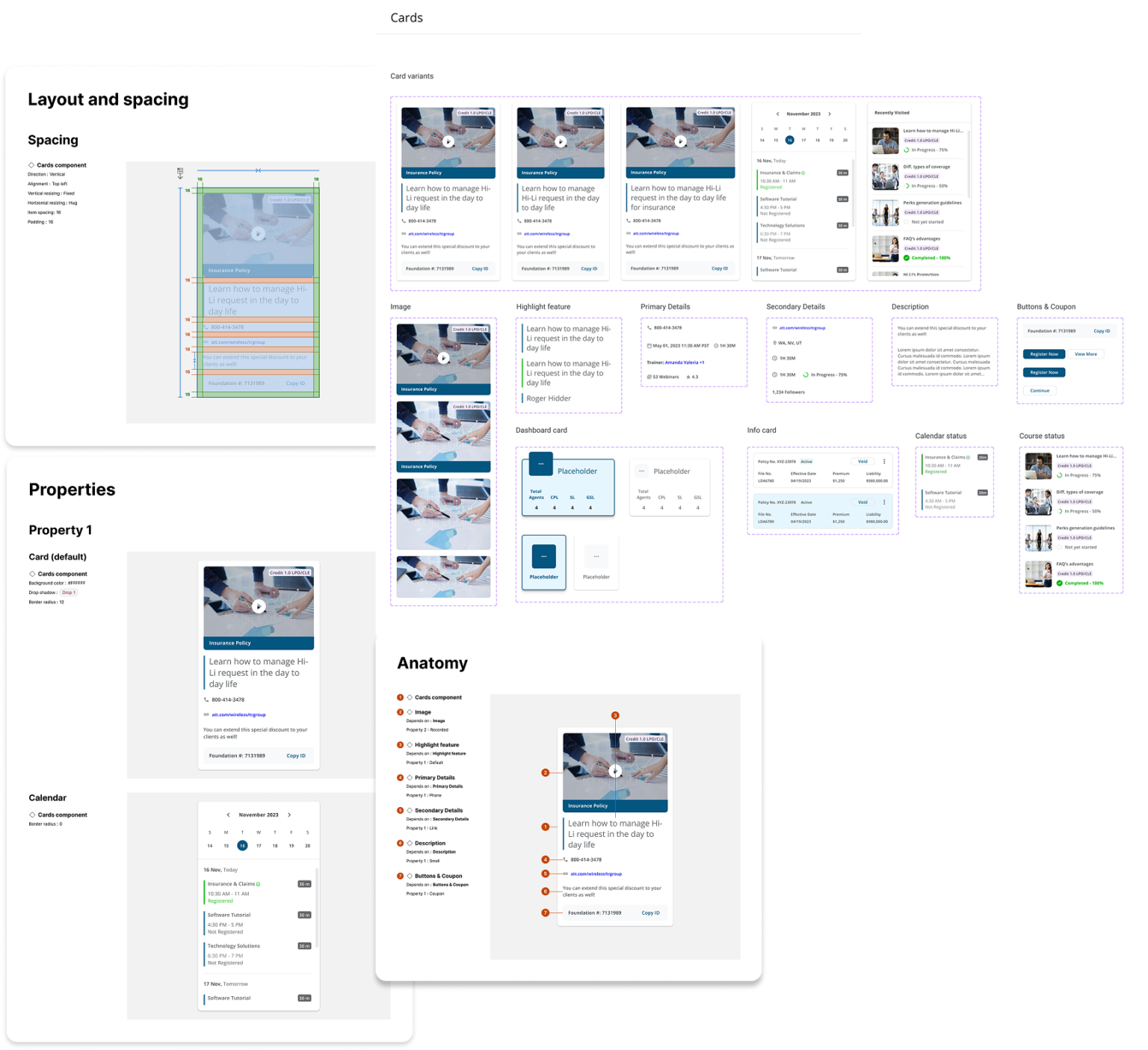
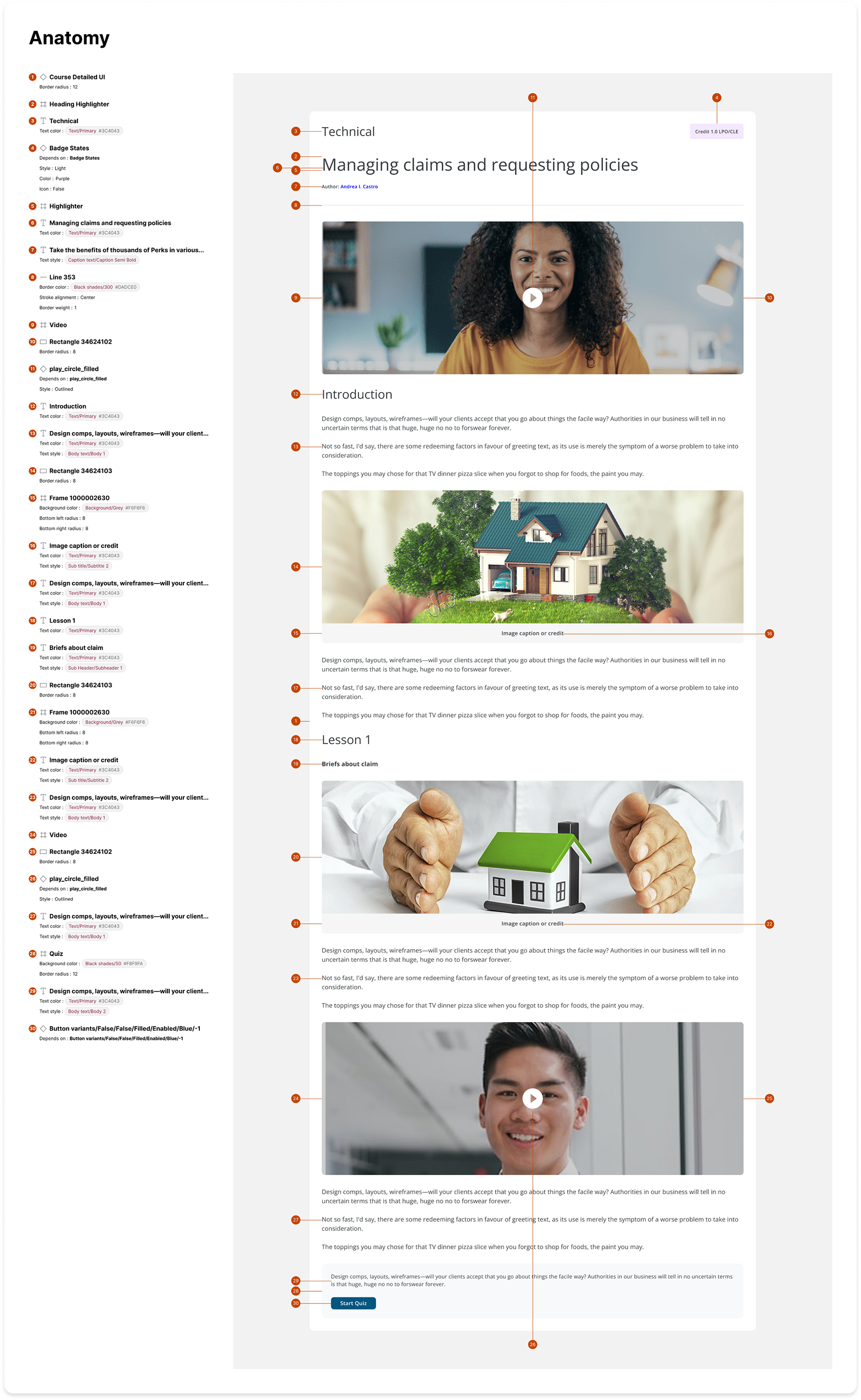
No design system is complete without comprehensive documentation, which I established for Title Insurance. Serving as the central source of truth for all things Title Insurance design, Version 1.0 of the documentation site provides detailed guidance on design atoms and molecules that form the foundation of Title Insurance’s system. It includes core principles, color, typography, iconography, component documentation, usage guidelines, and case studies to ensure consistency and scalability across teams.
Additionally, I structured the documentation to support ongoing iteration, governance, and adoption, enabling seamless collaboration between designers and developers.
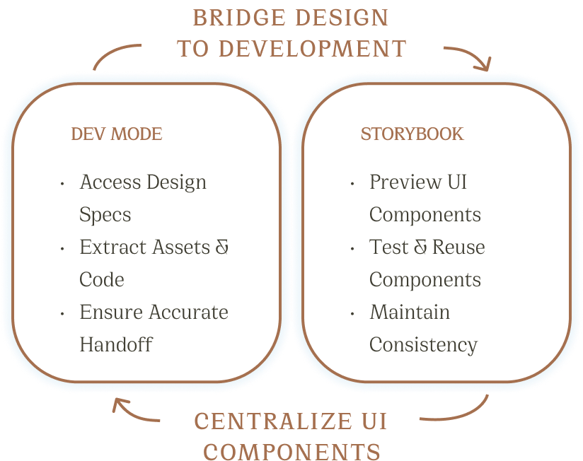
Seamless Design-to-Development Workflow To bridge the gap between design and development, I implemented a structured handoff process using Dev Mode and Storybook.
Dev Mode: Enhancing Collaboration
Storybook: A Living Component Library
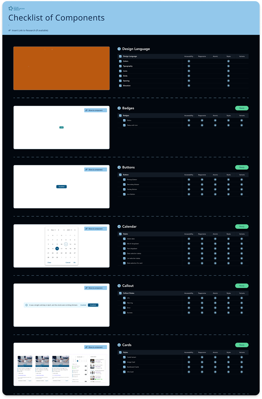
Leading the design system from scratch taught me how to balance consistency with flexibility across teams. I learned to define scalable foundations—like tokens and atomic components—while aligning engineers, designers, and product stakeholders. Introducing governance models, cross-team collaboration rituals, and a shared design language helped me see how systems thinking can drive efficiency, quality, and adoption at scale.
Feel free to reach out for collaborations or just a friendly hello 😀
viraj.avachat@gmail.com
© 2025 | Viruism | Viraj Avachat
© 2025 | Viruism | Viraj Avachat